Why use animal symbolism in your logo?
Using animals in your logo design can be a powerful strategy to create a memorable brand identity. Animals have long been associated with specific traits and stories, and incorporating these symbols into a logo can help convey the desired message to the audience. Animal logos are visually appealing and can capture the attention of potential customers.
Animal symbolism can be used even if the business has nothing to do with animals. For example, a technology company can use a lion in their logo to symbolize power and strength, or a healthcare brand can use a snake to represent healing and transformation. These symbols help connect the brand and its intended audience, reinforcing its values and characteristics.
Furthermore, animal symbolism adds depth and meaning to a logo. By selecting the correct animal symbol, businesses can tap into the rich history of symbolism associated with that particular animal. For instance, a lion logo can evoke feelings of courage, leadership, and authority, which can contribute to building a solid brand image.
Moreover, animal symbolism can also be a way to differentiate a brand from its competitors. With so many businesses in every industry, it’s crucial to stand out and be memorable. By incorporating animal symbolism into a logo, a brand can create a unique visual identity that sets them apart. Additionally, animal symbols have universal appeal and can resonate with people from different cultures and backgrounds, making them a versatile choice for global brands.
Incorporating animal symbolism into your logo can provide numerous benefits for your brand. Not only does it create a visually appealing design, but it also helps to establish a connection with your target audience. Using animal symbols adds depth and meaning to your logo, allowing you to tap into the rich history of symbolism associated with that particular animal. By carefully selecting the correct animal symbol, you can effectively communicate your brand’s values and differentiate yourself from competitors.
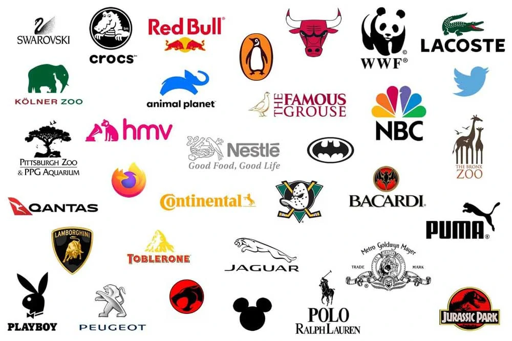
Famous brands using animal symbolism
Many famous brands have successfully incorporated animal symbolism into their logos. Let’s take a look at a few examples:
Duolingo
Duolingo’s popular language-learning app uses a distinctive green owl character as its mascot and logo. This wise owl named “Duo” embodies the brand’s spirit of fostering education and intellectual growth.
The choice of an owl as their mascot is an intentional one by Duolingo. Owls have long been associated with wisdom, intelligence, and scholarship in many cultures worldwide. The owl’s large eyes and stern gaze evoke a sense of solemnity and contemplation, suggesting deep thought and focus… great attributes for your brand. As such, Duo the Owl reinforces Duolingo’s mission to provide a practical and engaging learning experience that helps people expand their knowledge.
The green colour of Duo is also symbolic. Green typically represents nature, freshness, and renewal. For Duolingo, the vibrant green plumage of their owl mascot visually communicates the idea of cultivating new skills and personal flourishing. It reinforces their commitment to helping their users grow by learning new languages. The green colour also stands out, making Duo eye-catching and memorable.
The duo often wears a graduate cap in Duolingo’s branding and marketing materials. This again links back to education and the accumulation of knowledge. It portrays Duo as a learned teacher guiding Duolingo’s users in their language studies. Even Duo’s name hints at his purpose – “duo” meaning two in Latin, referencing the two persons involved in a teacher-student relationship.
So, while friendly and whimsical, Duolingo’s choice of a green owl as its central icon is thoughtful. Duo’s associations with wisdom and growth allow him to represent Duolingo’s mission to foster engaged language learning through technology. His memorable and appealing image helps build brand recognition across Duolingo’s global user base.
Crocs
The iconic logo of Crocs footwear features the outline of a crocodile in a circular emblem. This unique logo effectively captures the essence of the Crocs brand.
The crocodile was chosen to represent many essential qualities that define Croc’s shoes. Crocodiles are known for their rugged, leathery skin and armoured bodies, making them the perfect symbol for the durable and resilient Crocs material. Just as a crocodile’s hide can withstand the rigours of nature, Crocs shoes are designed to be long-lasting and withstand heavy wear.
In addition, crocodiles are considered efficient and powerful predators, able to traverse land and water to hunt prey swiftly. This speaks to the versatility and functionality of Crocs, which are water-friendly shoes that can transition seamlessly from land to sea adventures. The crocodile logo conveys that Crocs deliver reliable performance in and out of water.
Yet despite their fearsome reputation in the wild, crocodiles have an endearing, almost comical image in pop culture, from tickling their bellies to wearing them on hats. The whimsical crocodile in the Crocs logo and brand adds a playful personality that matches the brand’s lightweight, casual and even quirky image.
So, every time you see that iconic Crocs logo, think of the toughness and versatility of the crocodile. It’s a visual reminder that Crocs shoes are made to be durable, efficient, functional and fun – the perfect shoes for casual comfort and adventure. The crocodile symbol has become synonymous with the Crocs brand.
Lacoste
The iconic Lacoste crocodile has been a symbol of style and sophistication for over 90 years. Lacoste, the renowned French clothing company, was founded in 1933 by tennis legend Rene Lacoste and Andre Gillier. Lacoste embraced the crocodile as his emblem on the tennis courts, and it later became the brand’s signature logo.
The origins of the crocodile trace back to Lacoste’s tenacious playing style and nickname “The Crocodile”, which he earned in the 1920s. During a significant tennis championship in 1923, Lacoste bet with his team captain that he would win an important match or a crocodile skin suitcase would be his. Lacoste won the critical game and embraced the crocodile, putting the reptilian logo on his blazer.
When Lacoste partnered with Gillier to launch his brand and new clothing line in 1933, the crocodile logo was boldly embroidered on the breast of the revolutionary short-sleeve cotton piqué tennis shirt, the “polo” shirt. The lightweight, comfortable shirt changed drastically from the formal and stiff tennis attire typically worn during the era. The stylish polo shirt bore Lacoste’s emblem and became an instant classic.
Over the decades, Lacoste’s reputation for quality and innovation has made the embroidered reptile a global status symbol. The timeless crocodile represents a harmony of elegance, sporty comfort, and French chic. The logo itself is an aesthetic and visual statement. The green crocodile is intentionally uncluttered, using clean lines and negative space to create a striking impression. The contemptuous crocodile remains relaxed yet vigilant, defiantly facing the world with its mouth closed and eyes open, suggesting quiet confidence.
Today, Lacoste’s snapping crocodile continues to represent the brand’s heritage while symbolizing modern style, sophistication, and luxury. The iconic reptile endures as a design classic, cementing Lacoste’s place in fashion history.
Jaguar
The iconic Jaguar logo features the sleek silhouette of a prowling jaguar, capturing this majestic big cat’s feline grace, speed, and power. As one of the foremost luxury automotive brands worldwide, Jaguar aims to echo the Jaguar’s athleticism and elegance in its lineup of high-performance vehicles.
The leaping Jaguar has been central to Jaguar’s brand identity since its founding in 1922; originally known as the Swallow Sidecar Company, the company first placed the jaguar emblem on its vehicles in 1935. Even in those early days, the bold, streamlined logo spoke to Jaguar’s dedication to stylistic innovation and engineering excellence.
Over the decades, Jaguar has modernised and refined the details of the logo, but the essential image of the leaping Jaguar endures. Rendered in glossy black against a polished silver backdrop, this athletic cat symbolises the spirit of speed, agility, beauty and power that Jaguar attempts to capture in the ride and handling of its luxury sports cars and sedans. The centred Jaguar conjures visions of flawless momentum, muscularity and grace, fitting associations for vehicles intended to perform as well as they look.
Beyond the Jaguar itself, the stark, minimalist presentation of the logo aligns with the core facets of the Jaguar brand identity: sophistication, elegance, and luxury. By reducing the iconic Jaguar image to its essential outlines, Jaguar conveys that its brand identity stems from classic and timeless ideals rather than passing trends. For decades, the Jaguar logo has aptly represented the blend of elegance, performance and fine craftsmanship that elite consumers expect from the British automaker.
Penguin
The iconic logo of Penguin Books features the silhouette of a penguin, an instantly recognisable symbol of the pioneering publishing company. The origins of the Penguin logo date back to 1935, when Allen Lane founded Penguin to make quality literature available to the masses at an affordable price.
The apt choice of a penguin to represent Penguin Books speaks to the qualities and values embodied by the company. Penguins are known for their adaptability and ability to thrive in the harshest polar environments, thanks to their resilient nature. This reflects Penguin Books’ strength and flexibility as a publisher, having weathered many storms and challenges over the decades since its founding, all while remaining committed to bringing a diverse array of literature to readers.
The Penguin is depicted in refined, simplistic black and white, evoking a classic, timeless aesthetic. This clever design creates visual harmony and cohesion across Penguin’s extensive catalogue of books and titles. The striking, balanced use of black and white exudes confidence and authority, symbolic of Penguin’s trusted reputation as a publisher of literary excellence.
Yet while the Penguin radiates sophistication, there is also approachability in its friendly, endearing form. The font used for the company name amplifies this effect with its soft, rounded edges. Together, the logo presents Penguin Books as authoritative and accessible, their brand bridges the gap between mainstream and literary fiction.
For over 80 years, the enduring penguin logo represents Penguin Books’ heritage and principles. As the company expands globally, across digital platforms and into new territories, the distinctive Penguin remains at its heart, a proud symbol of Penguin’s past, present and future.
Swarovski
Swarovski’s iconic swan logo epitomises the brand’s enduring legacy of excellence and artistry in crystal and jewellery design. The graceful swan with outstretched wings has been associated with Swarovski since 1895, when founder Daniel Swarovski adopted it as his emblem. Over the decades, the Swarovski swan has evolved into one of the most recognisable logos in the jewellery and accessories world.
The swan symbolises elegance, beauty and grace – qualities that Swarovski has exemplified in its finely crafted crystal creations for over a century. Its elongated neck represents the brand’s attention to delicate details. The swan’s wings, decorated with intricate feather-like engravings, reflect Swarovski’s mastery of precision-cutting crystal using state-of-the-art techniques. The sparkling Swarovski crystals that make up the swan’s body evoke the brilliance and fire inherent in the brand’s crystals.
Beyond the swan logo’s aesthetic appeal, it also speaks to Swarovski’s heritage and legacy. Swans possess long lives, and Swarovski has endured as a crystal manufacturing and design leader through generations. The logo connects the brand to its roots in Wattens, Austria, near the River Inn, whose swans inspired the young Swarovski’s founding vision. The Swarovski swan encapsulates the commitment of the brand to unmatched quality, craftsmanship, and technological innovation for luxury consumers worldwide, making its crystal creations shine brilliantly. More than a century after its inception, the iconic Swarovski swan continues to represent beauty, luxury and the pursuit of perfection.
NBC
The iconic logo of the American broadcast television network NBC features a vividly coloured peacock spreading its plume of feathers. This recognisable logo was initially designed in 1956 by John J. Graham and has undergone minor updates and revisions over the decades. Still, the peacock itself has endured as a symbol of the network.
The choice of a peacock for NBC’s logo was strategic, as the bird’s brilliant plumage evokes a sense of vitality, spectacle, and pride. NBC founder David Sarnoff was seeking a logo that would represent the promise of this new medium of television, which in the 1950s was still an exciting technological advancement, allowing families across America to experience entertainment and television programming together in their living rooms for the first time. The peacock’s feathers, with their jewel tones of emerald, royal blue, indigo, jade, and gold, represent the bright colours which could be broadcast through television screens.
Even more importantly, a peacock spreading its tail feathers also signifies a grand showcase or display. For NBC, their brand and logo perfectly captured their mission to bring quality entertainment and news programming to American households through the wonder of television. The hundreds of “eyes” in the peacock’s tail symbolise the ability to reach millions of viewers who would tune in to popular NBC shows. Over the decades, hit NBC programs like The Tonight Show Starring Johnny Carson, Saturday Night Live, The Cosby Show, Seinfeld, ER, Friends, and The Voice have attracted large viewing audiences.
The peacock logo ties the imagery of color, vitality and showmanship together in one memorable and recognizable brand icon. It is an emblem of NBC’s legacy as one of the longest-running American television networks, still going strong today since its founding in 1926 as one of the first nationwide radio networks. For over 60 years, the peacock has been a constant visual reminder of NBC’s commitment to delivering quality entertainment and news programming to its viewers.
Ferrari
The iconic Ferrari logo featuring a prancing horse encapsulates the essence of the legendary Italian sports car brand. Ferrari’s founder, Enzo Ferrari, chose the prancing horse as the company’s emblem in 1923 after winning the Savio circuit, where he met Count Francesco Baracca, an Italian aviation hero during World War I. Baracca featured the prancing horse on his planes for good luck, suggesting it would bring success to Ferrari, too.
The black prancing stallion on Ferrari’s distinctive yellow background symbolises the brand’s core values of speed, power, passion, prestige, and performance. The powerfully muscular horse frozen mid-gallop evokes Ferrari’s racing pedigree and dominance on the track. Its rampant posture captures a sense of forward surging motion and speed.
The bold silhouette of the Ferrari stallion exudes an air of nobility and authority associated with the cavallino rampante, or “prancing horse” in Italian. The distinctive red Ferrari color amplifies the brand’s racing spirit and passion. The prominent placement of the prancing horse on sleek Ferrari vehicles and merchandise reinforces its role as an instantly recognizable global emblem of luxury and accomplishment.
For over seven decades, Ferrari’s cavallino rampante logo has come to represent excellence in sports car engineering, seductive Italian styling, and the ultimate driving experience. The prancing stallion remains a fitting symbol of Ferrari’s dominance, prestige, and racing pedigree as one of the most recognizable luxury brands in the world.
About us and this blog
We are a digital marketing company with a focus on helping our customers achieve great results across several key areas.
Request a free quote
We offer professional SEO services that help websites increase their organic search score drastically in order to compete for the highest rankings even when it comes to highly competitive keywords.
Subscribe to our newsletter!
More from our blog
See all posts


Recent Posts
- Is It Hard To Find A Small Business Consultant Near Me? April 20, 2026
- Consequences Of Not Having Final Expense Insurance March 23, 2026
- 10 AI Prompts to Save Business Owners Time March 11, 2026